Australian Government Design System
Design System ・Graduate Program
Context
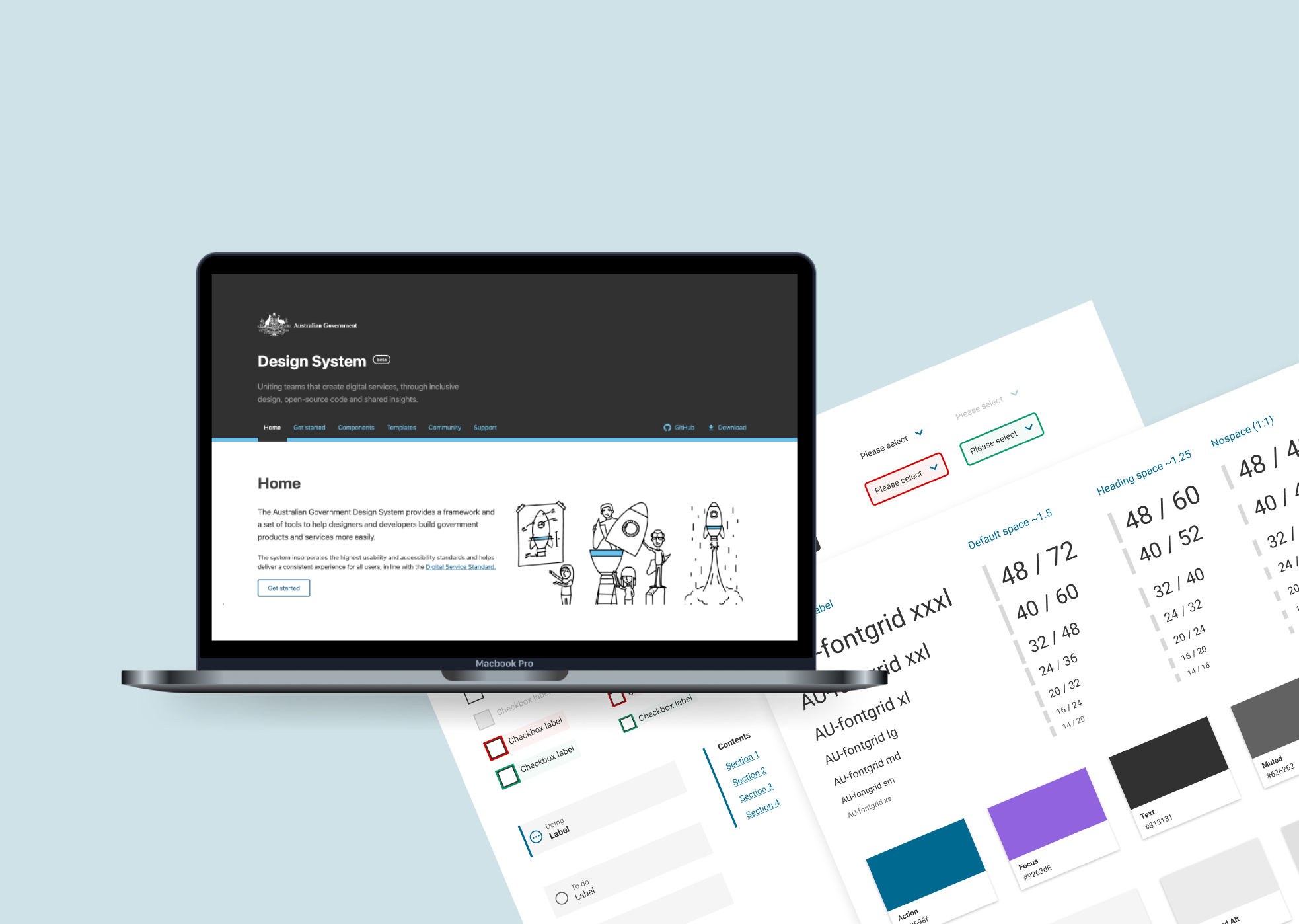
The Australian Government Design System was created in 2017, and since then have produced many components used by 50+ government agencies. The new Design System Team’s mission was to create new components for future government projects, including the new myGov.
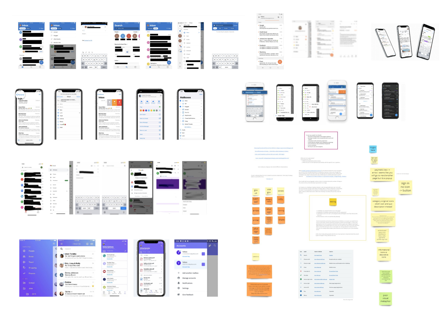
My role was to migrate all the components from Sketch to Figma to allow more collaboration amongst designers in the organisation and make it easier for them to reuse components and styles through a shared asset library. I also contributed to the research and ideation for new components.
My Role
Create reusable components and styles in a shared asset library, Migrate components from Sketch to Figma, Research and Ideate on new components
The Team
Designer (Me), Design Lead, Front-end developer.
Timeline
February - July 2021
Some of my achievements from the Design System Team, as my first rotation in the graduate program…
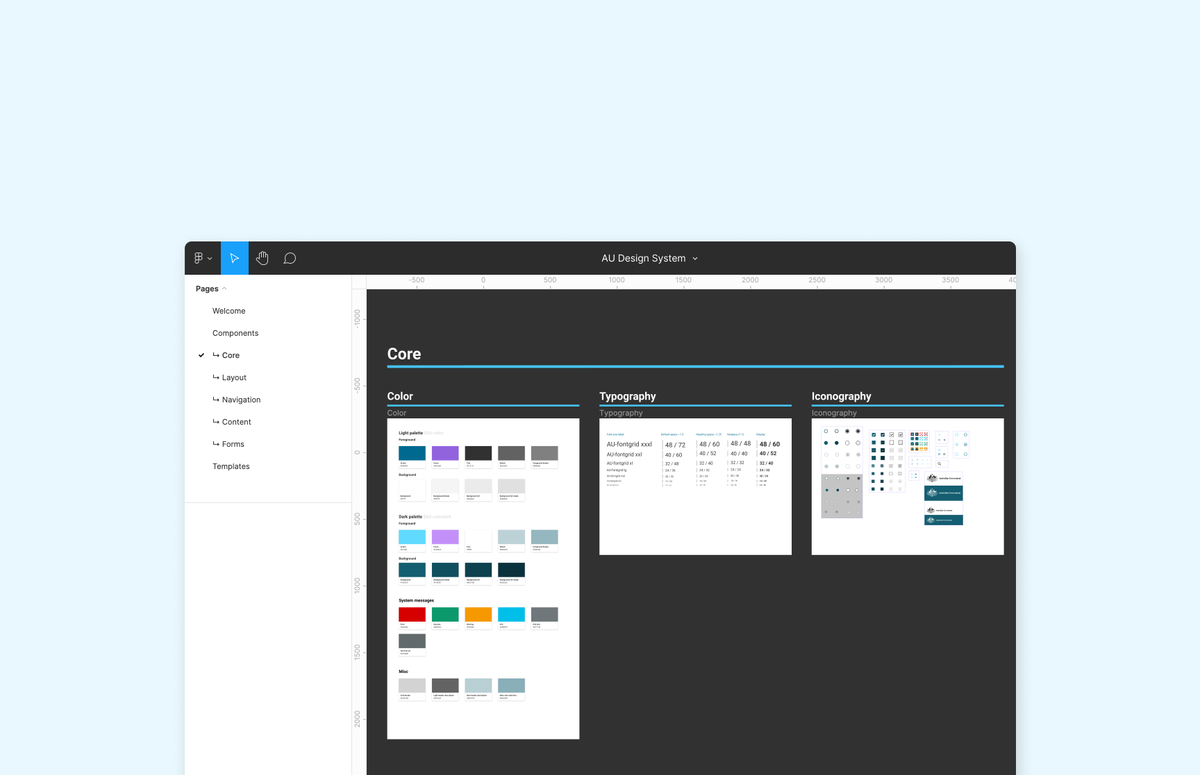
Migrated the Sketch UI kit to Figma, creating an asset and template library
Moving to a modern software like Figma meant more room for shared collaboration and an increased uptake of the design system across our organisation with easy access to the assets.
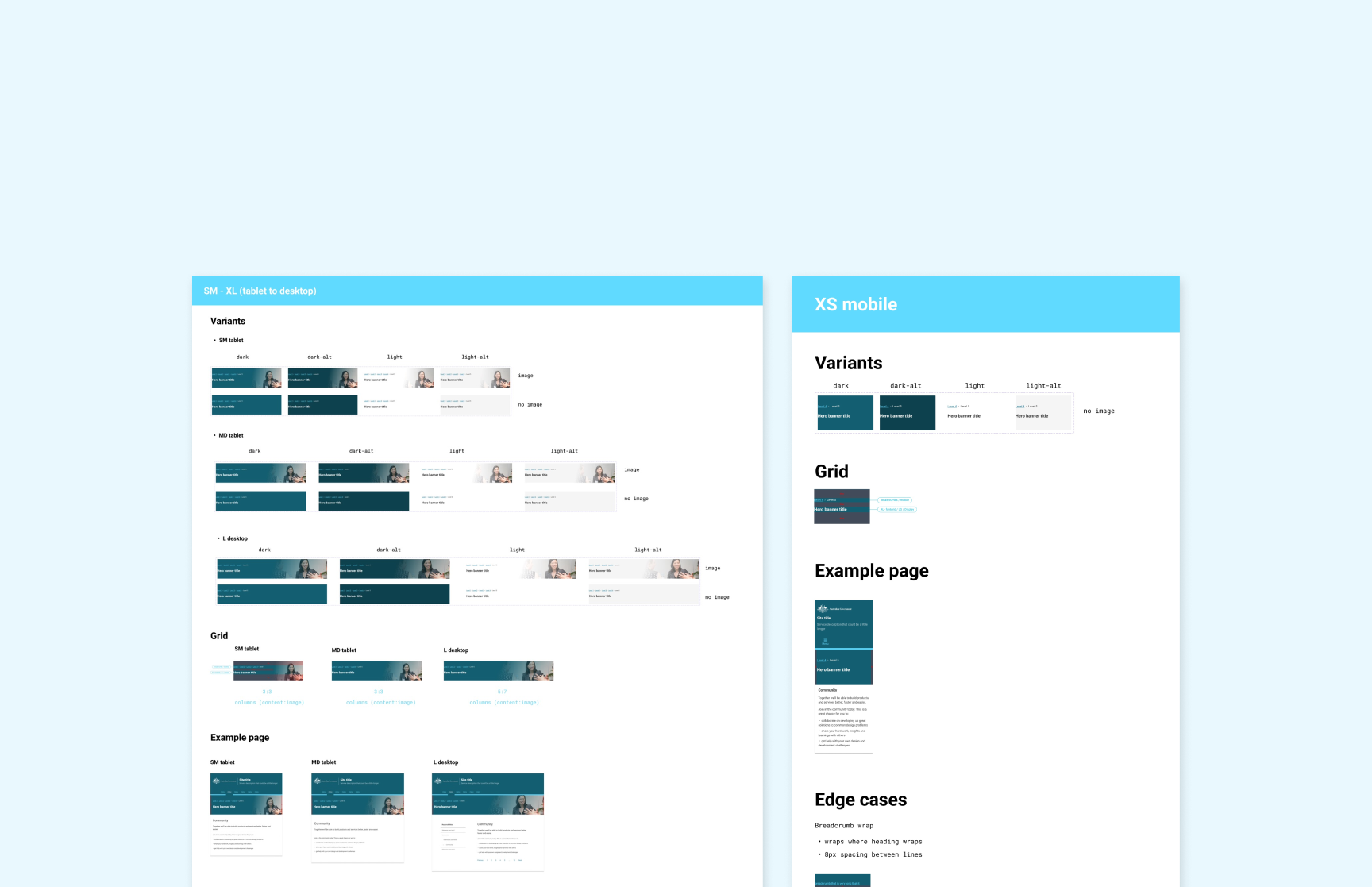
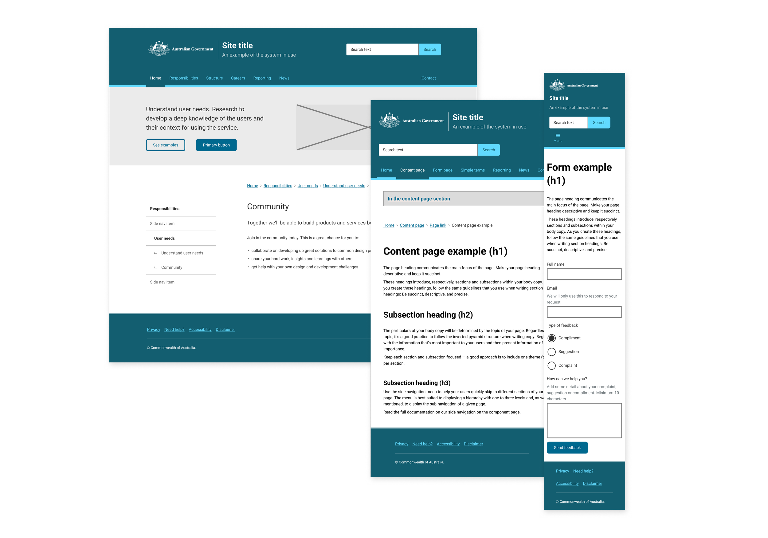
Design and handover a new component to UI engineers
I took responsibility of designing and handing over the new series banner component to be used across multiple department projects and websites.

Helped establish a workflow for the team
With a new team and new priorities, we needed to establish a workflow where the team could best ship new components and work together.

The Goal
Designers and developers are under pressure to build more, faster, and better. The goal of the Australian Government Design System is to reduce code and design duplication across government and deliver a more consistent government experience.
Design Principles
01
Users’ needs to come first
02
Consistent, not uniform
03
Function over fashion
04
Support for wide range of devices, browsers and orientations
05
Maximise opportunities for reuse
06
Evidence over opinion
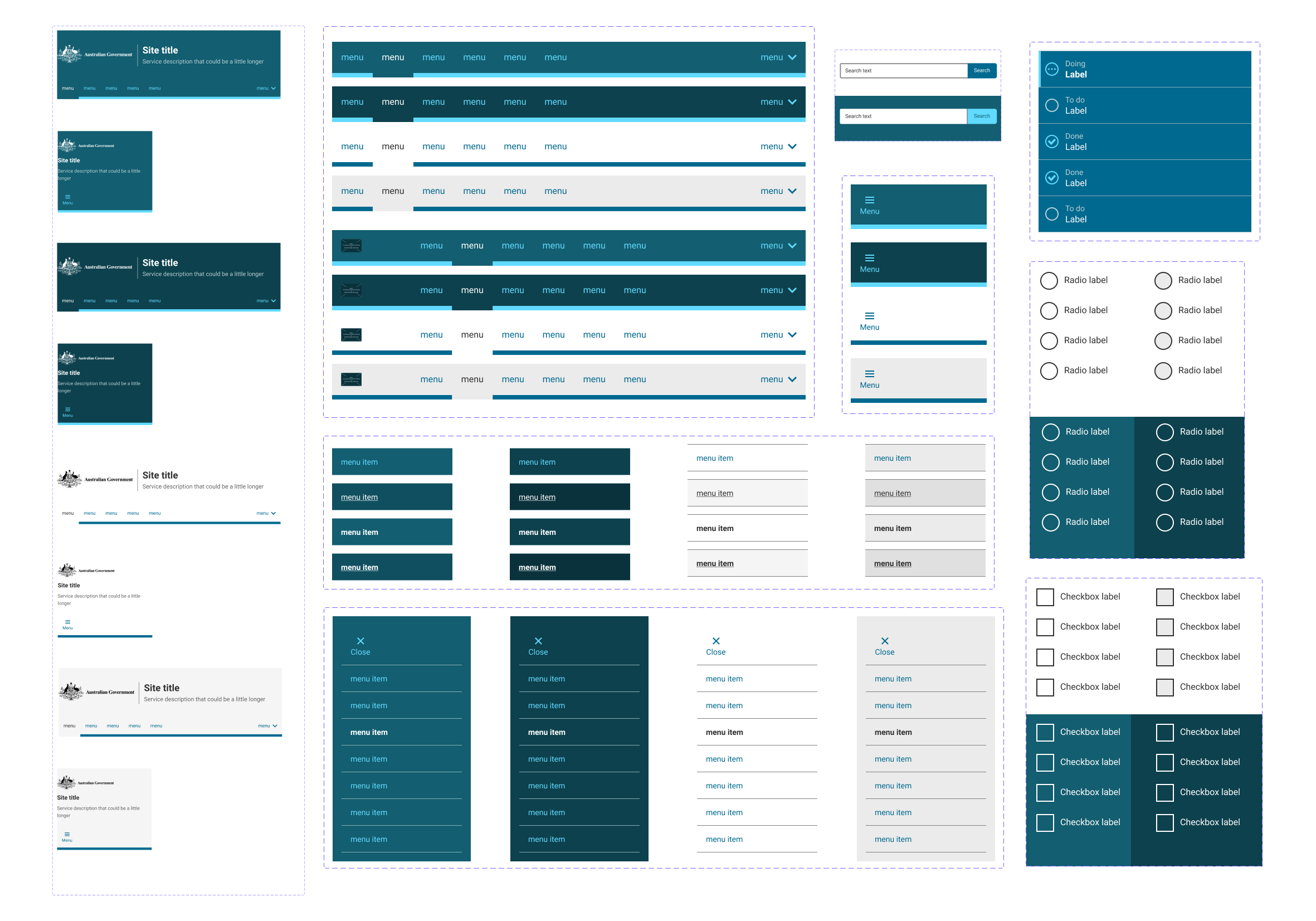
I designed over 20 components that were responsive and customisable with different colours and states.
To prototype faster, more collaboratively and work closer to engineers, there was a need to migrate the old UI kit that was created in Sketch to Figma.
Discovery
Prioritising what to build first
The first thing our team does when building a new component is prioritising what components to build first, considering these factors:
User Needs
Do we have evidence that the proposed component provides a good user experience, above any existing or alternative component? If yes, we can proceed.
Global Components
All global components will take priority. Existing Design System components will be assessed to see if new component requirements can be met by creating variants or if new components are required.
Component Status
Is the component currently in use, built with the intent to use later or has it been superseded by a new component?
Does the component already exist?
Can we save time by using components from other government agency design systems?
Research
After choosing what component we were going to prioritise and begin building, I conducted desktop research and looking at other design system’s, such as GOV.UK, Atlassian and Material Design, and analysing how they created and documented their components.
We also observed current user research if it was available to help us inform our design decision.

Design and Handover
I owned the design and handoff of the new series banner component, collaborating with the design lead and accessibility expert to build inclusive, scalable components.
Here are some takeaways from this experience:

Engage the engineers early in the process
In this scenario, it was important to work closely with the engineer to ensure the image in the banner was responsive and discuss how it will behave at each breakpoint.

Map out all use cases, edge cases and requirements
Having a document of all important information made a good reference sheet and helped logically understand what was required before visualising it.
Establish a good feedback loop
I worked closely with the design lead to receive regular feedback. This helped in picking up any errors and making changes earlier on so the handover goes smoothly.

Monitor and measure impact
It was important to make an impact in designers workflows so they could easily find relevant components, make modifications, not worry about responsiveness and prototype and design more faster.
Reflection & Outcomes

Presented @ the Interaction Design Guild
I had the pleasure to present a demo of the Design System Figma file to the guild, sharing how to use it and how people can access it to use in their own projects. It was also a great opportunity to receive feedback from users.

It’s important to look closely and also from afar
I learnt to look at things closely, making sure it’s pixel perfect, but also remembering to take a step back to see the bigger picture and how it works as a single component and as part of a bigger ecosystem.

Helped teams prototype more efficiently
It was great to see an uptake from designers in the organisation using the Figma library, as well as contractors from consulting agencies working on government projects and also designers from other government agencies including The Department of Agriculture, Water and the Environment.